Clark/Sullivan Construction has a new look. Part 2
The Sparks-based construction firm is in the process of rebranding itself, including a new logo and design for its equipment, signs, letterhead and website as well as eventually a sleeker company name to go with it.
The firm has been steadily moving from a go-it-alone, hard-bid contractor to a collaborative bidding method known in the industry as construction management at risk, and wanted to overhaul its image to reflect that.
Earlier this year, after four firms responded to its request for proposal, Clark & Sullivan hired Stan Can Design in Reno. In August, the design firm brought in Johanna McLain, a brand identity consultant, to start by crafting the company’s brand pillars.
The result was seven corporate tenets that form the foundation of the company’s refurbished brand.
“The big ‘aha’ moment for us was discovering people were more important than the buildings they build,” says Stan Byers, owner of Stan Can Design. “People are a much bigger part of the equation than the artifacts they leave behind.”
Sheila Hlubucek, director of business development at the construction firm, agrees.
“That is essential for us because we’re trying to be collaborative not dictatorial,” she says.
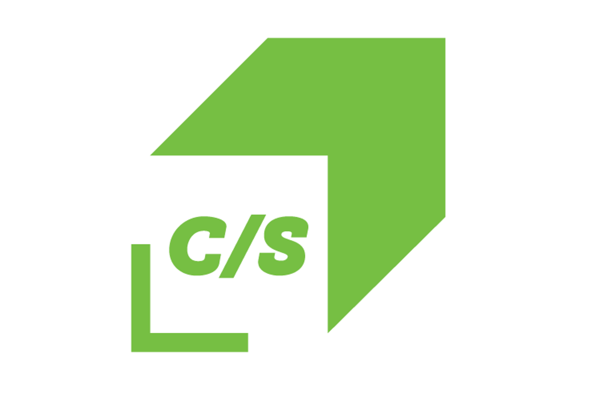
Byers and his team came up with a new corporate logo, a building block, pointing upward and conveying movement, underscored by the company name and initials that can be detached and used independently.
“I knew instantly it was a good mark,” says Byers.
So did Clark & Sullivan leadership, which immediately chose the design over another Byers presented at the same time. The logo color is a vibrant green, inspired by the city.
“Sheila likes the Sparks green used on their signs,” says Stan.
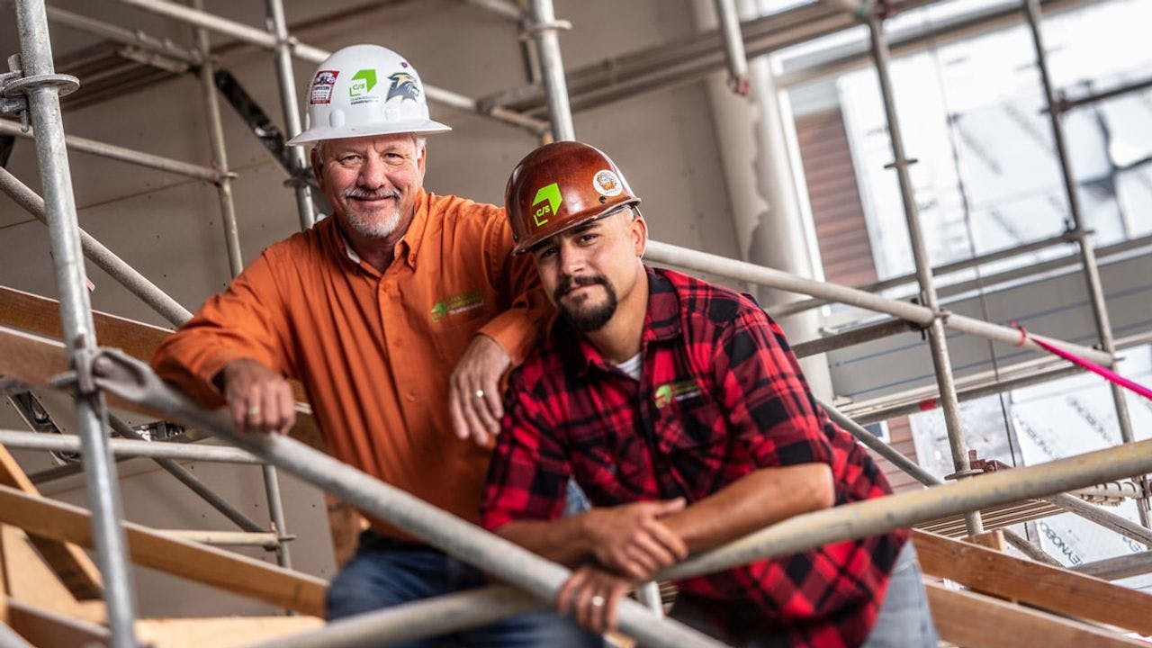
It’s also a color that reproduces fairly consistently as everything bearing the new logo, from job site signs to coffee cups to hard hats, will be produced by a different vendor.
For example, Granite Construction Supply and Sign Shop, an independent sign maker of one of the firm’s competitors, emblazoned the new logo on eight of Clark & Sullivan’s trucks.
The new emphasis on people rather than products led Byers to pick Museo, what he calls a humanistic typeface and a family of fonts that can be used everywhere, from huge sign lettering to the small-point type on business cards and in bid proposals.
His shop also designed about a dozen icons that can be used throughout proposals, both as symbols of content and as way to break up text-heavy documents.
And, Byers wrote the company’s new tagline – the partner to build with – being used everywhere.
The logo includes the company’s full name and, more prominently, its initials – C/S. Eventually, says Hlubucek, the company may move to using C/S instead of Clark & Sullivan since it is in a slow evolution of transferring ownership from its founders and leaders to its employees.
“That’s a typical flight path for businesses,” says Byers. “You go from International Business Machines to IBM.”
In October, the company held an internal launch party, a key step in the new brand’s success, says both Byers and Hlubucek.
“I was really gauging the success of it by how well employees embraced it,” says Hlubucek. “The staff has been really good, putting it on forms, and wearing it. It’s validation we did the right thing.”
Hlubucek says when the company chose its designer, it looked at both the bid for a scope of work and at hourly rates assuming that the rebranding process would be a long-term project.
“When do we walk away? Hopefully never. I see design as an important asset to their company,” says Byers. “The next big phase is the Web site.”
Part 2 – http://www.nnbw.com/news/13856908-113/company-says-byers-clark